CLAIRVEDA
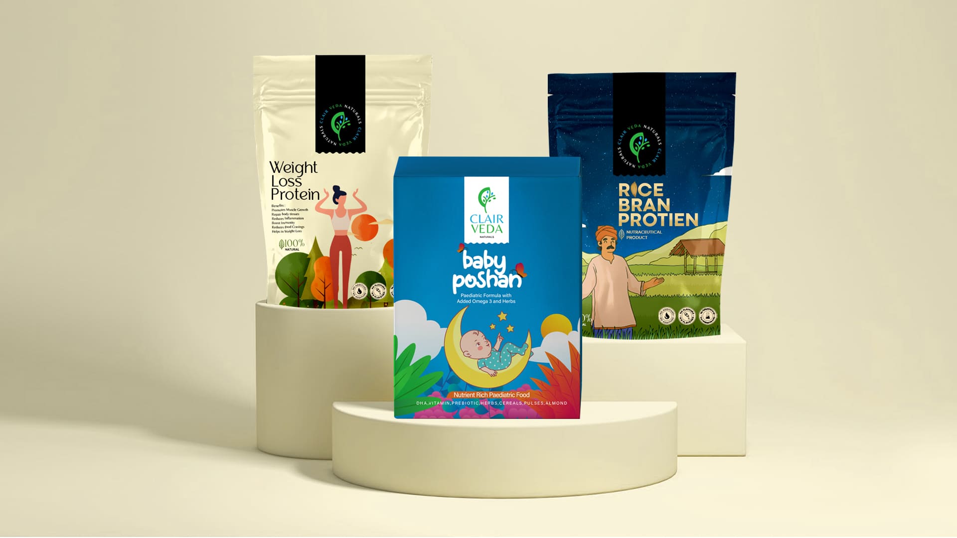
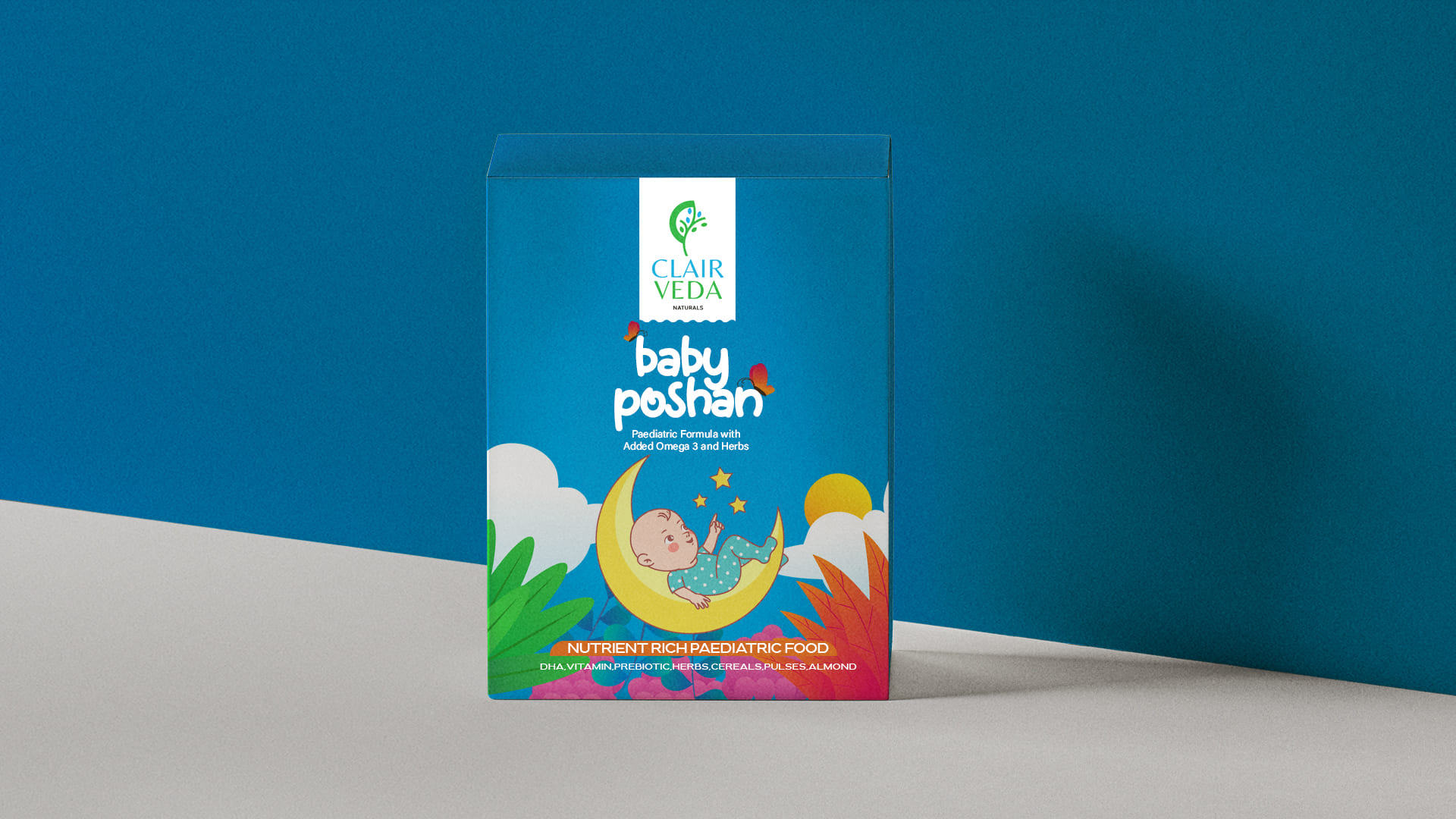
The logo for Clairveda could incorporate a vibrant, abstract representation of a leaf to symbolize the brand's commitment to natural, health-focused products. A palette of fresh greens and soothing blues could convey a sense of vitality and tranquillity.
For the brand name "Clairveda," a clean and modern sans-serif font is employed to reflect simplicity, clarity, and a contemporary aesthetic. The typography maintains a balance between professionalism and approachability, Ensuring that the brand appeals to a diverse audience.
The Clairveda logo encapsulates the brand's essence: a harmonious blend of nature and science. It communicates a commitment to health and well-being through nature-inspired elements. The colour palette enhances the overall visual appeal, Creating a logo that not only stands out but also conveys a sense of trust and vitality to potential consumers


The triumph of your brand hinges on your character rather than the tangible aspects of your brand."

